About Block Island Concierge:
BIC is a new seed-stage startup on Block Island. They offer a concierge service connecting visitors, homeowners and businesses on the island to create packages with a local flair.
The company is comprised of a mother and two daughters, and I was brought in to creatively and operationally help launch their business and coach the team on how to organize a service based business.
Building a brand from scratch:
Messaging and tone:
As a part of brand development, I workshopped the mission, messaging, tone, and ideal customer avatars with the team. I sourced competition and inspiration sites to set the standards for the company.
The team settled on a light and fun, family- and service-oriented voice. Drawing from the founder discovery meetings and business plan writing, I created the verbiage for the brand launch site and Phase II site, as well as rack card, business card, tee shirts and 10-12 pieces of internal documentation including How-To and FAQ sheets. I also scripted, designed, animated and voiced over a 1m30s promotional video.
I am most proud of my short headings and slogans on the pages of the site.
Color and logo:
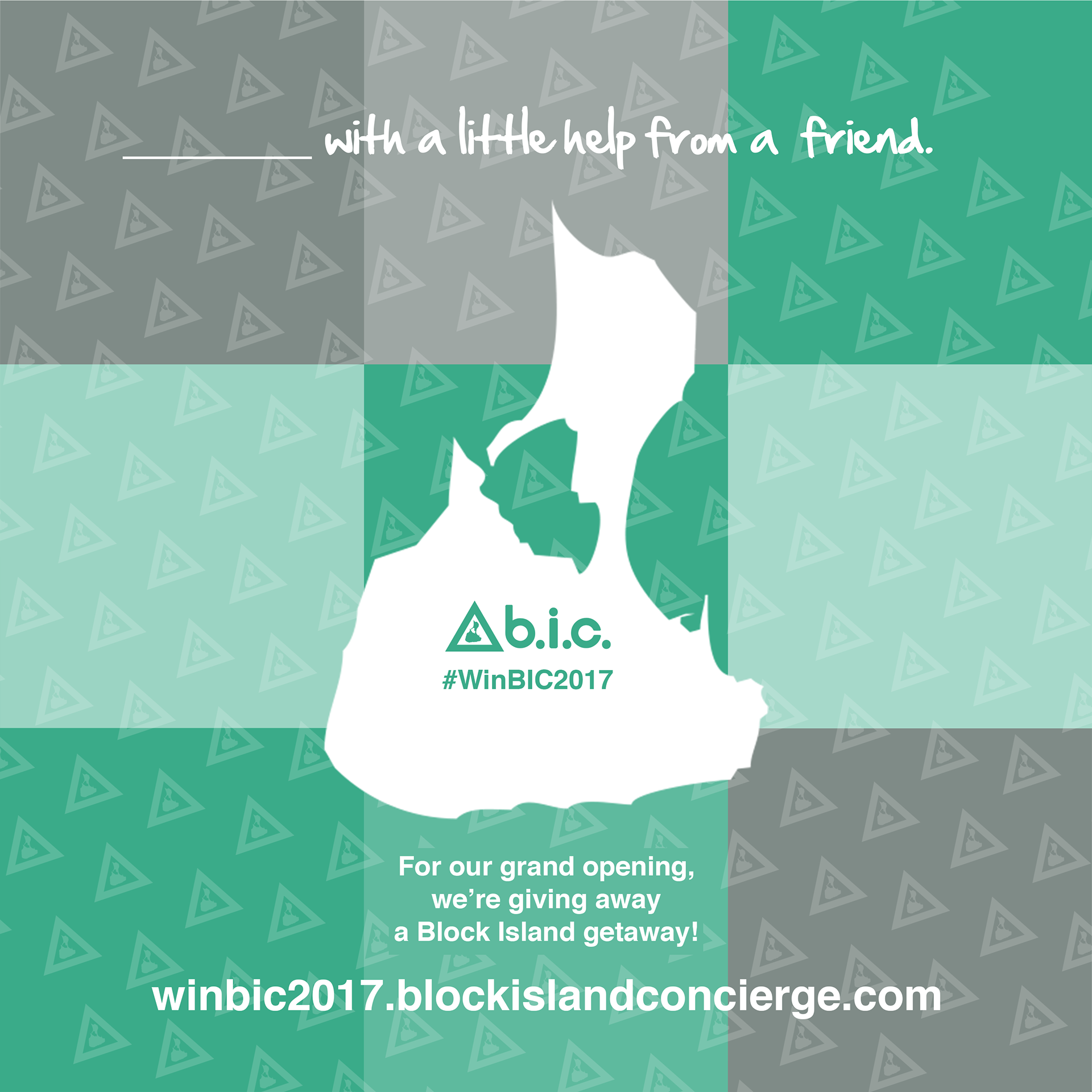
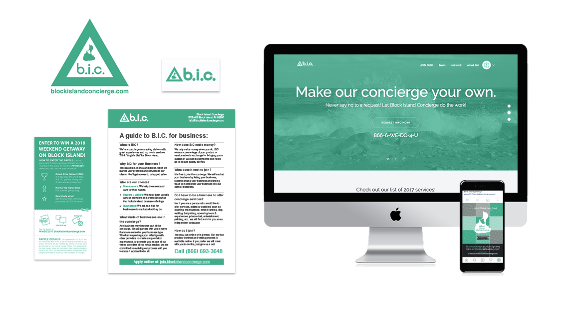
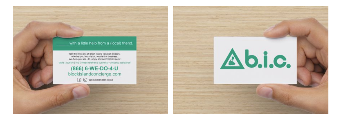
I created a logo using a triangle shape to represent these three facets of the business. Inside the triangle I set a vector image of Block Island.
I used a simple sans serif font to create the logo mark, and adjusted widths, kerning and edges. I used the periods in the acronym to differentiate from the well-known pen brand BIC®.
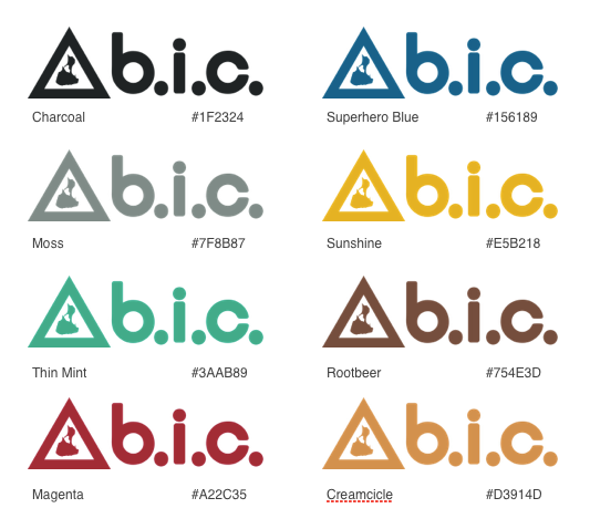
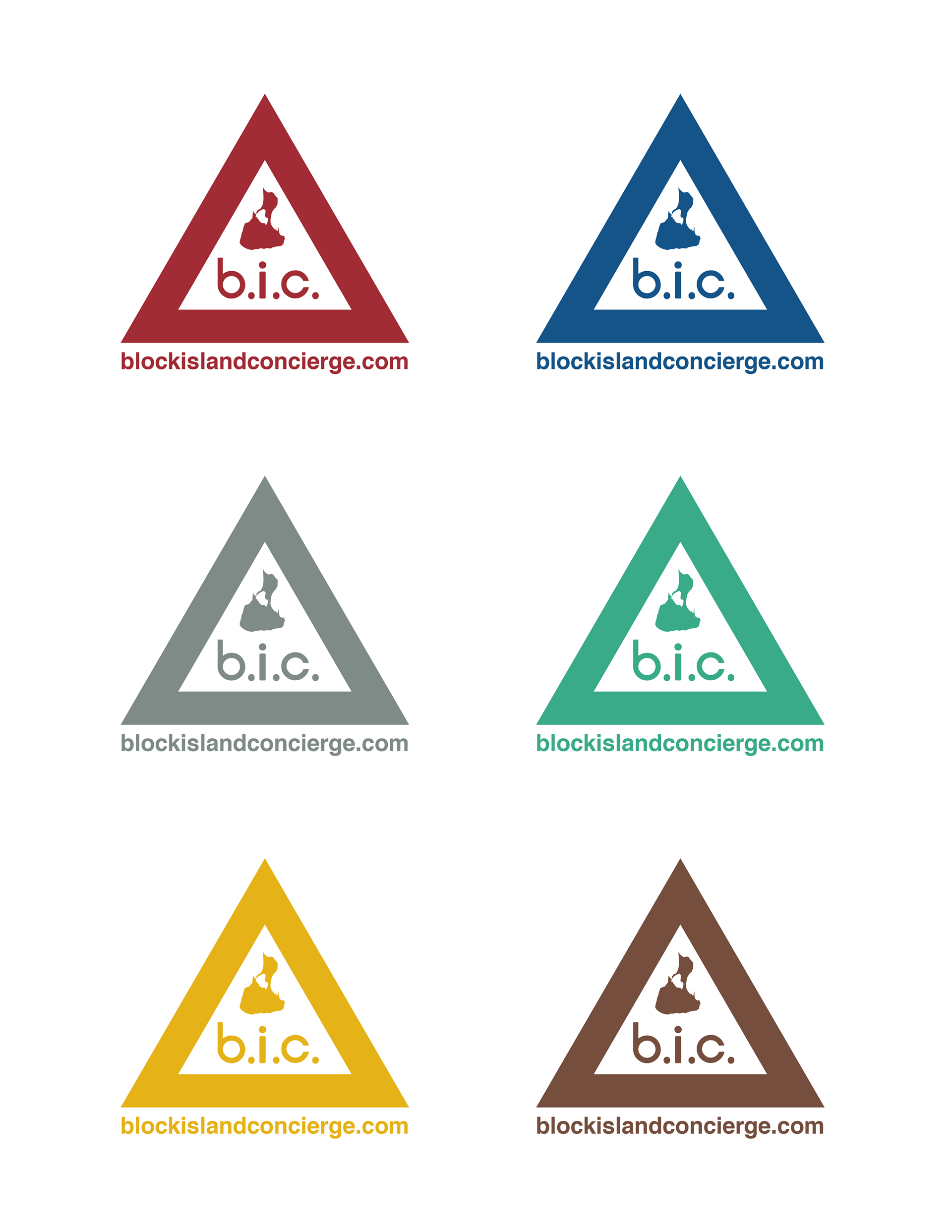
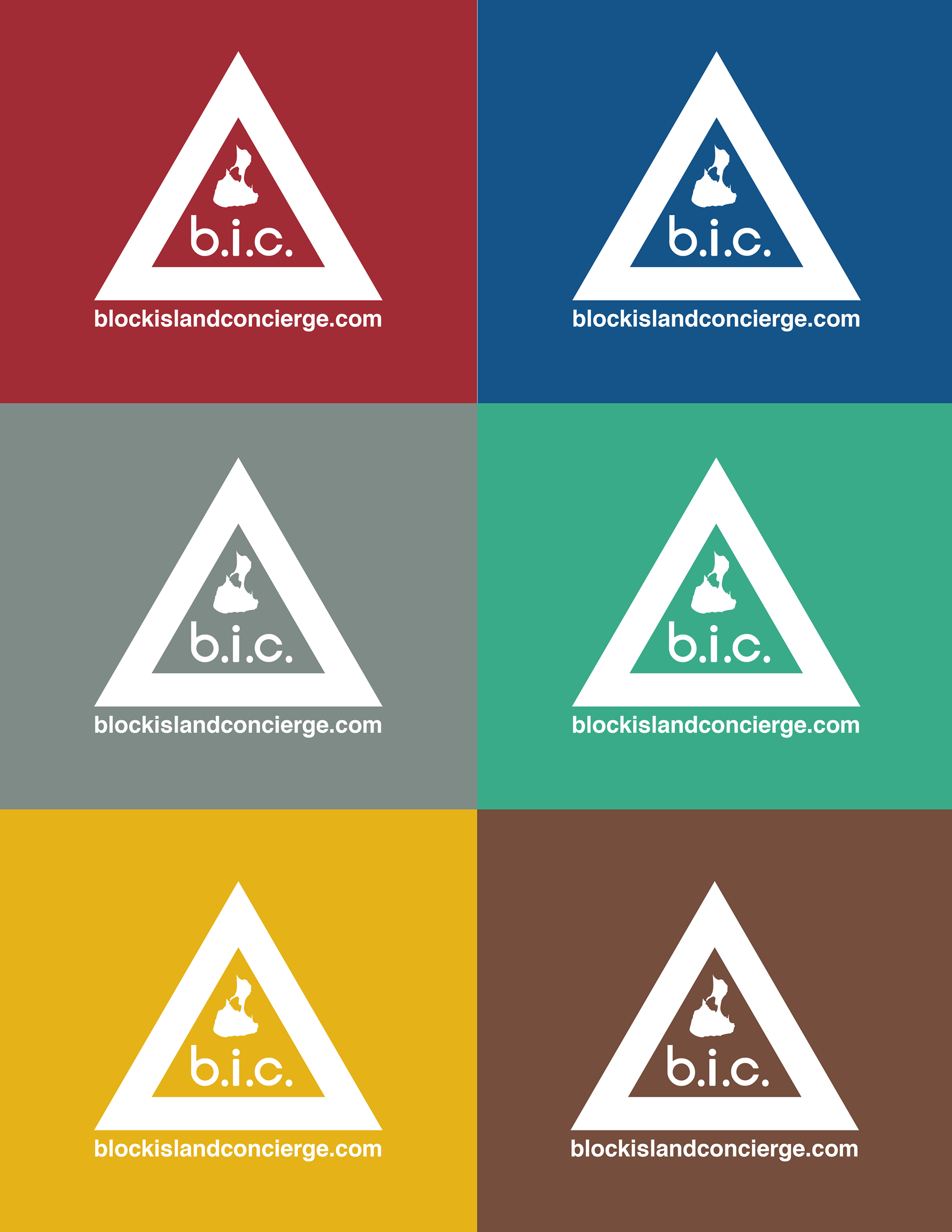
While I wanted to make the main brand a single color, the travel and tourism section of our website would need some color coding for different categories relating to the island. I selected, named and added to the style guide a variety of 8 brand colors with their HEX and RGB values. Since Block Island is a classic New England coastal community, I started with traditional New England historic house paint colors for inspiration. Then, I gradually deepened and saturated the colors to create a more vibrant gem tone look.
I set the main color for the brand our green: Thin Mint. It is eye catching, sits well with other colors, and is not overused in the Block Island business community. Psychologically, green means go, so it felt right for a launch.
The brand standard is either the Thin Mint logo against white or white on Thin Mint. I went from version 1.0 which was an outline variation and much less chunky and striking, to version 2.2 which is the current logo in both horizontal and badge styles, as well as variations with the site included and others with just the icon. I tested the logo for visibility at 22 different sizes, and the final logo is a vector shape.
Attention to detail: I created a brand style guide/bible including font, colors, guidelines and templates for letters and documents. I created vcards for the team with our logo and company info included for quick sharing.


Print & Promotional Materials:
A simple and affordable logo-driven business card was my choice, and I created a rack card featuring a getaway raffle for 2018 and information about both BIC and the mother’s business BIRO. I created a slogan and design for our teeshirts “Block Island with a little help from a (local) friend.”

Site Structure, Wireframes, and UI/UX:
BIC was intended to be a hybrid of two businesses (a concierge, and a tourism website and lead generator) under the umbrella of the mother’s vacation rental business. I needed to tie these 3 businesses together in a single brand. The result was a landing page for each facet of the business, as well as the main landing page featuring and highlighting each segment of the business.
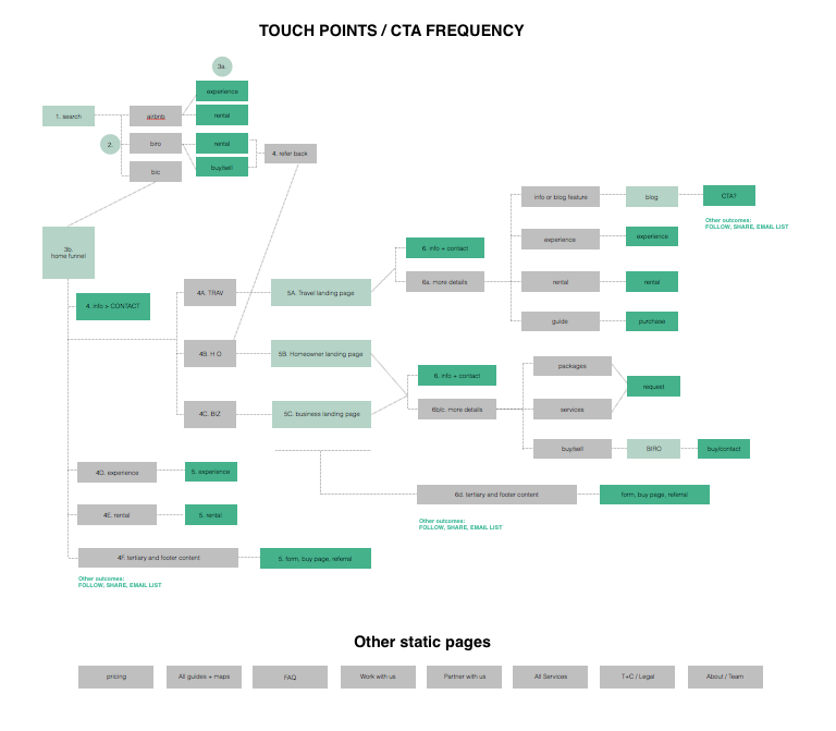
I first used paper and markers to conceptualize the flow of business and the various functionalities that would be needed to promote the services and products we’d offer.
Then, I created a flowchart to analyze how many actions users would need to access what they were looking for. As a new business, we wanted to guide the consumers through the funnel according to their vertical. I chose not to resort to a general search bar style at this time, seeing as our goal is to curate and guide customers from a local perspective.
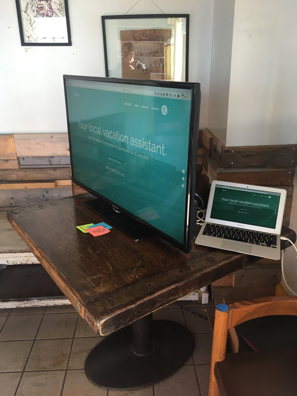
The full site (set to launch 2018) is designed to be built in WordPress, and the tourism portion makes use of the blog features, offering guides, experiences, downloadable audio tours and more. Using tabbed panels, categories are broken up above the fold.
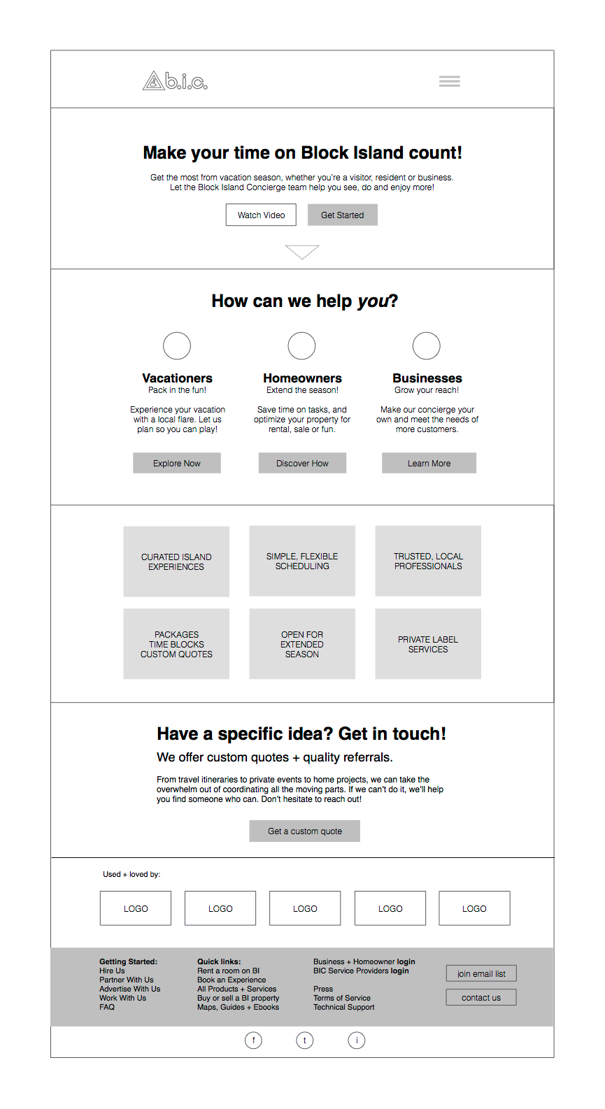

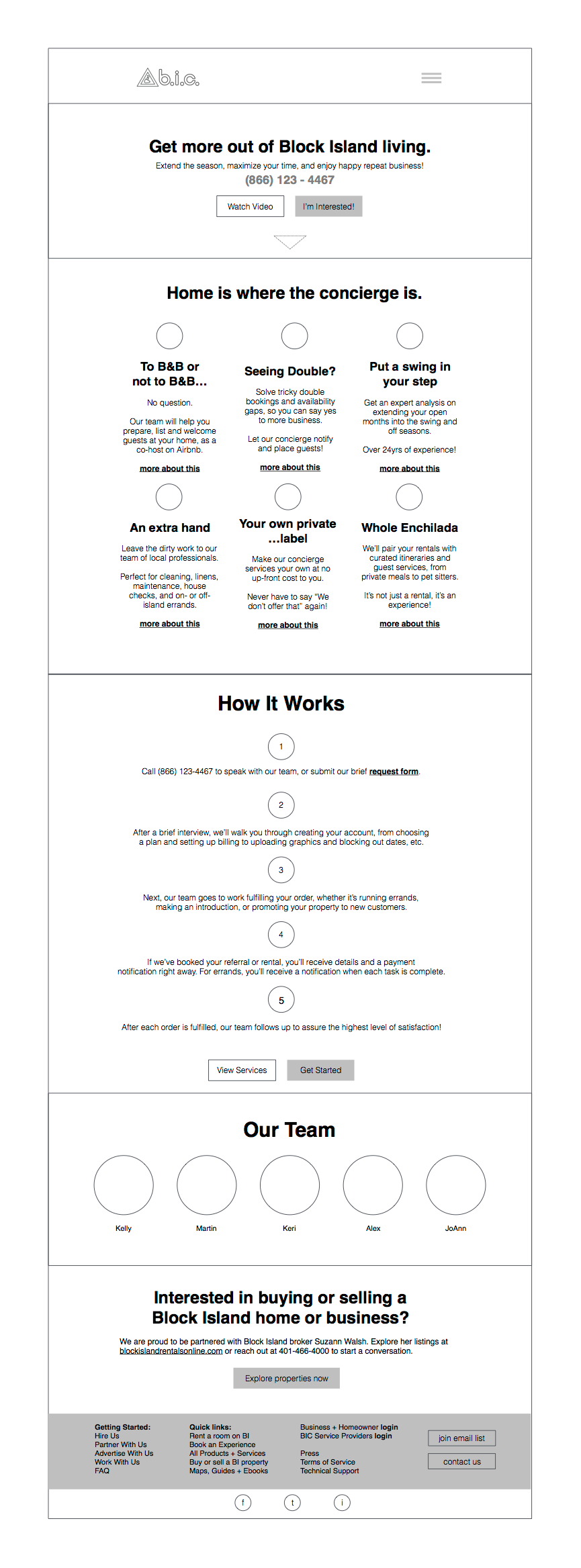

The temporary site is a customization of a beautiful HTML5/CSS template. It acts as a simple summary of the larger site, with links out to our getting started and how it works pdfs, as well as full Mailchimp automated email list integration and service provider intake forms customized through JotForm.

Launch & Pitching:
Leading up to launch I created a basic social media profile with branding on Facebook, Instagram and Twitter. For Instagram I used the tiled layout to present a “puzzle style” larger image on the profile, for a nice presentation.
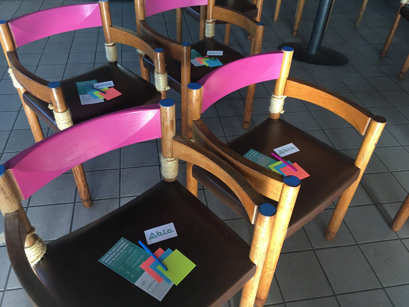
60 days from our start together, we invited 25 businesses on the island to a salon and brainstorming session at a local restaurant. I used Adobe Spark to create a quick testable invite to the event. For the pitch and Q&A I created a 30-minute walk-through of our company, including a demo of the new mobile-friendly temporary launch site. I used Asana to run down the agenda, played the promotional video, and lead the conversation session at the end. We got an amazing reception, and there was strong interest, and there were many compliments on our professionalism.

Operations & Internal Training:
To get the business off the ground, the team needed product development and direction for the systems of marketing, customer service, delivery, billing and internal operations. I created a road map in Asana linked to each project for the year for goal setting. I lead weekly meetings by chat, phone or in person to go over details and business development.
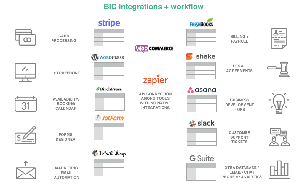
We collaborated on setting pricing, package creation, and general workflow. I helped onboard the full team to Asana for project and task management, Freshbooks for billing and Shake Legal for contracts. I also recommended and configured all our API linked apps and services. I assisted in setting up our domain names, emails and toll free number directory tree.
Below is a graphic illustrating how I used API technology to help "lean launch" this smaller startup without the advantage of an in-house development team or outside seed capital.
A few more social + marketing designs: