About the LugHug brand:
LugHug is a lightweight collapsible harness that transforms ordinary carry-ons, bags or boxes into a sturdy backpack. Every purchase helps create jobs for people in need!

Reverse engineering for speedy marketability.
I first imagined the LugHug product concept in 2013, while traveling in Spain. It all started with the name, as I wandered down flights of train station stairs after arriving at the airport Madrid. I was literally hugging a rolling carry-on to my chest, as rolling it was not an option. All I wanted in that moment was to temporarily turn that luggage into a backpack.
Later that week, I started sketching out ideas for how a portable luggage harness might be built on my iPad, and scribbled notes about how it could be marketed. With the concept top of mind, more and more potential uses popped up in my daily life.
I decided to fully workshop the idea, and give it a proper business plan. Using the rough sketches of the user interface, I expanded on the business processes: acquiring materials, hiring labor, testing, prototyping, manufacturing, packaging. Then I outlined the steps for marketing: surveys, beta testing, promotional versions, fundraising, e-commerce store buildout, creating and testing ads and landing pages, getting press etc.
This year, I decided to flesh out the designs and run numbers for a prototype. As a designer, it's sometimes easier for me to work backwards, in order to see if a business idea will fly. My approach with the messaging and designs was to imagine I was a customer looking for the product. How would I hope to discover it? What would I need to know in order to buy? What would tug at my heartstrings?
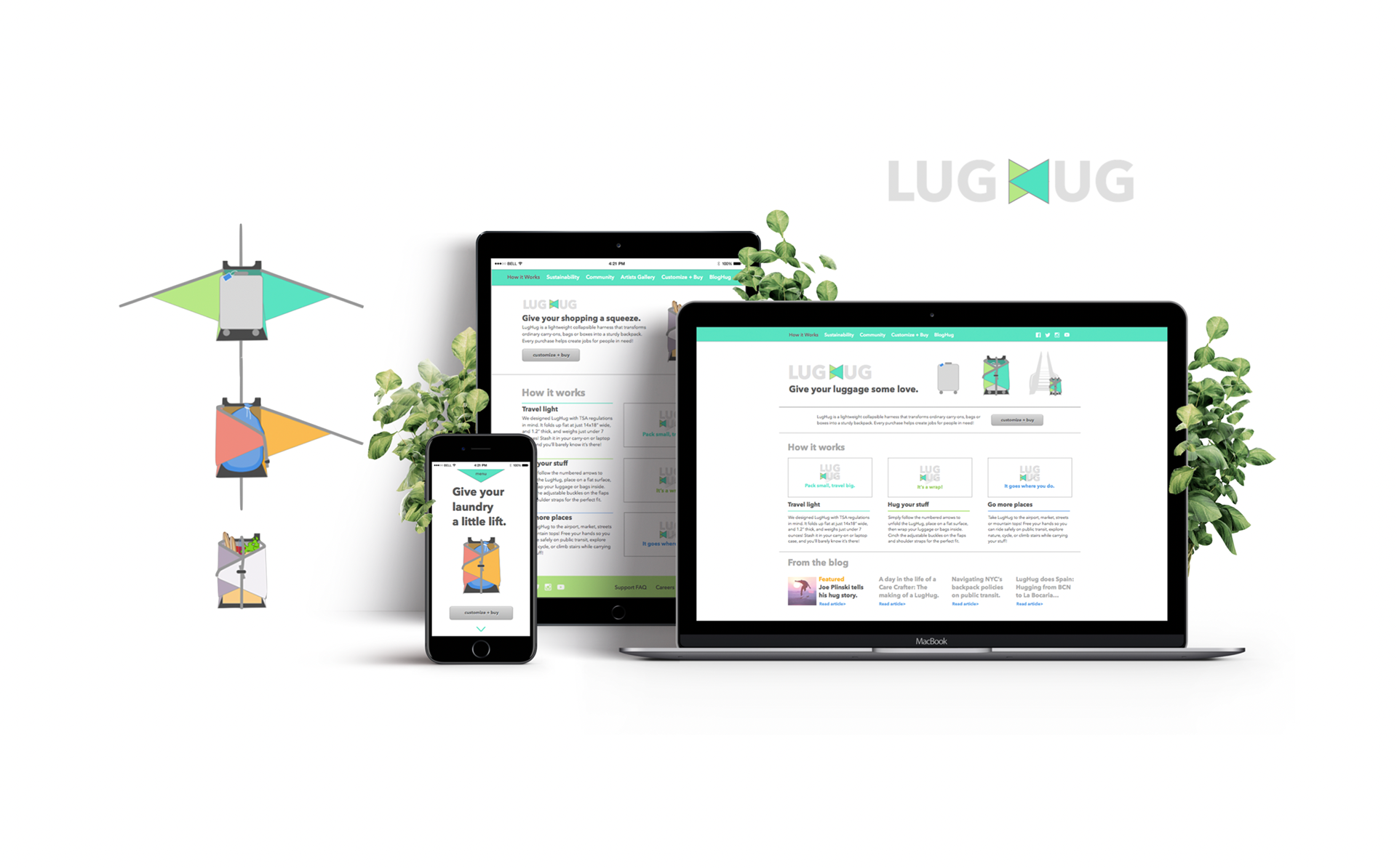
I used Sketch to create what I believe to be a convincing set of product images to use as a visual start. Next, I developed three adventurous color schemes: Sunset, Palm and Tundra. Imagining scenarios in which I'd dreamed of having such a product, I developed three use case scenarios: luggage, groceries, and laundry. From there, I wanted to work on the voice and tone of my brand, so I created the tag line for each use case scenario. By this point, I was getting a tingle, as the concept began to gel. Back into Sketch I went! I designed the luggage, groceries and laundry image assets, and several views of each being "hugged" by the LugHug harness.
At this point in the process, I wanted to go further with the story for each use case, so I added environment to nail down the real struggles that come with lugging things around in your arms. I visualized the customer with the laundry on a bike, the one with groceries on the train, and finally the one with luggage at an airport with many escalators. There could be countless more environments.
Next, I designed the logo. It needed to be dead simple, usable as a patch or tag on the product, and visually subtle, so as not to overpower the physical product (I hate that!). I decided to use the H in hug to mimic the product itself.
Finally, I created the responsive web design. I stayed in Sketch and chose to do a mobile-first approach, starting with the iPhone6 layout you see on the right below. I like to keep things simple, so I opted for the tag line, an image of the product, a "customize + buy" CTA button, followed by some brief details. At the bottom I included an icon logo (links to website) and the footer contains the full menu reiterated, in case people need a second to figure out the green arrow at the top is a pull-down. Next, I fleshed this design out for tablet, medium and HD screens, expanding each section and revealing more detail as the canvas size grew. I included dropdown multi-level menus, secondary menus (social, privacy etc), and a cheeky header. On larger screens, I featured the video-driven "how it works" section. On HD screens, there I used the extra real estate to highlight the blog.
Finally, I created the responsive web design. I stayed in Sketch and chose to do a mobile-first approach, starting with the iPhone6 layout you see on the right below. I like to keep things simple, so I opted for the tag line, an image of the product, a "customize + buy" CTA button, followed by some brief details. At the bottom I included an icon logo (links to website) and the footer contains the full menu reiterated, in case people need a second to figure out the green arrow at the top is a pull-down. Next, I fleshed this design out for tablet, medium and HD screens, expanding each section and revealing more detail as the canvas size grew. I included dropdown multi-level menus, secondary menus (social, privacy etc), and a cheeky header. On larger screens, I featured the video-driven "how it works" section. On HD screens, there I used the extra real estate to highlight the blog.
Copy + Rapid Business Prototyping
My utter hatred of dummy content combined with my sheer adoration of rapid prototyping brings me to my process on writing copy. LugHug was a classic example of my "working backwards" method. Visualizing the end goal at the front gave me permission to create a big, bold entrepreneurial business concept and set the ideals.
With a project like this, where I own the full process, brand and voice, I enjoy going full tilt on the site development from a customer experience angle. As I mentioned, instead of writing a standard business plan, I like to make the site organization process perform double duty. So, instead of dropping in lorem ipsum to build out my wireframes, I take time to bake the content into the design, including philosophy, message, goals, dreams, attitudes and other nitty gritty details like policies + materials etc. Functionally, I can focus on the intention of each page, section and block. I can ask myself...what else needs to be here? What can I omit? If I were a customer, would this text excite me? Do I need more pictures? What processes will the site user go through in this part of the site?
These design questions help me sort out operational development as I go along. I have a hypothesis that with my left brain engaged, I can trigger the more left brain parts of business planning naturally. Without leaving the design flow, I workshopped questions like: What is our shipping policy? How much will shipping cost? What is the return policy? Will there be a guarantee? How can we get test users and photograph them with the product? What types of people will we want to reach out to for networking and blog guest appearances? What kinds of impacts do we want to have on the environment and socially?
In this way, I used my "dummy copy" as the foundation of my business plan, and as a vision board for the project all in one. And hey, some of the concepts in the designs might be analyzed, put in phases or scaled down, but dreaming is how I get things done, so why not dream big?